12 Dorm Room Color Schemes That Make a Small Space Feel Pulled Together
Choose from 12 dorm room color schemes with exact swatches, undertone guidance, and practical advice for working with fixed walls, floors, and furniture.
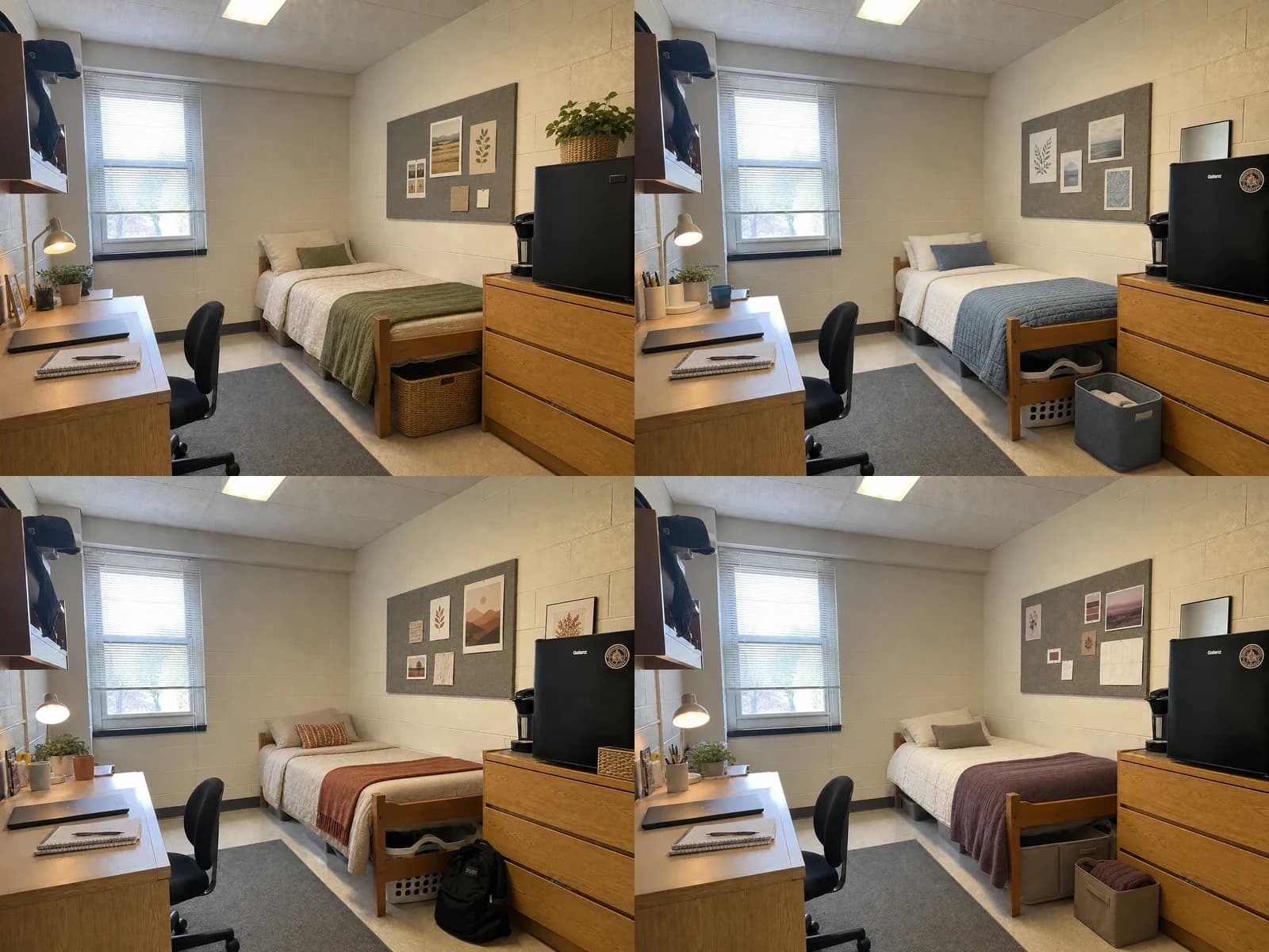
The best dorm room color schemes work with the room you are assigned instead of fighting it. Start with the undertones in the walls, floor, school furniture, and largest appliance; choose one light base, one main color, and one small contrast; then repeat those colors across bedding, storage, art, and useful desk accessories. The 12 palettes below include exact reference swatches and the fixed finishes each one handles best.
Color cannot solve a blocked chair or poorly sized storage. Use the modern dorm room ideas guide for the broader layout, lighting, storage, and buy-first plan.
How to Choose a Dorm Room Color Scheme
Photograph the empty room in daylight and identify the temperature of its fixed finishes. Honey oak, cream block walls, and tan flooring lean warm. Blue-gray carpet, bright white walls, and gray laminate lean cool. Black appliances and chairs can act as contrast in either direction. If the room mixes warm and cool finishes, choose a bridge color such as olive, mushroom, muted blue, cognac, or charcoal instead of trying to make every surface match.
A practical distribution is mostly light base, a smaller amount of the main color, and a limited contrast. It is a planning shortcut, not a rigid design law. The bed is usually the largest changeable surface, so choose its color first; use the rug, throw, art, and bins to connect it to the existing room. Compare fabric samples in morning and evening light before ordering several coordinated pieces.
Before hanging art or adding lighting, check the current residence hall policy. The University of Michigan Housing packing guidance updated May 6, 2026 gives one current example of rules for lamps, electrical items, adhesives, and roommate coordination; your own school is the authority for your room.
12 Dorm Room Color Schemes at a Glance
| Palette | Colors | Best with | Use it on |
|---|---|---|---|
| Olive + oatmeal | Ivory #F3EBDDOatmeal #CFC0A5Olive #747552Charcoal #3B3A36 | Honey oak, cream walls, gray carpet | Bedding, throw, woven bins, desk accents |
| Dusty blue + ivory | Ivory #F5F2E8Dusty blue #71879ASlate #4D5963Oak #B68450 | Cool gray floors, white walls, pale or medium oak | Quilt, pillow, art, storage |
| Terracotta + oatmeal | Cream #EFE4D1Oatmeal #C9B69AClay #A85F45Walnut #614737 | Warm beige walls, honey oak, brown-speckled floors | Throw, lumbar pillow, print, catchall |
| Plum + mushroom | Ivory #F1EADFMushroom #9B8C80Plum #654552Brass #A9814F | Warm gray floors, gray pinboards, medium oak | Throw, storage, small art, lamp detail |
| Navy + camel | Warm white #F4EFE5Camel #B78551Navy #26384BBlack #242424 | Orange-toned oak, gray floors, black appliances | Bedding edge, throw, leather-look tray, frames |
| Sage + clay | Soft white #F2F0E6Sage #9AA287Clay #B77458Graphite #4A4944 | Warm wood, off-white walls, neutral tile | Bedding, art, one clay accent, desk organizer |
| Charcoal + flax | Flax #D7C7A8Stone #AAA295Charcoal #3E4141Rust #9A563D | Black metal, black appliances, gray carpet | Neutral bedding, charcoal bins, rust pillow |
| Blush + burgundy | Cream #F5EBDDBlush #D8AAA5Burgundy #713B47Taupe #97867A | Warm gray, oak, cream or beige walls | Blush quilt, burgundy throw, taupe storage |
| Forest + tan | Ivory #F1E9D8Tan #B89A70Forest #344E3EBlack #252728 | Red or orange oak, institutional beige, black fixtures | Throw, one pillow, bins, line art |
| Lavender-gray + stone | White #F4F3EEStone #AAA49DLavender-gray #8E879APewter #565861 | Cool gray floors, white walls, gray furniture | Quilt, pillow, felt bins, abstract art |
| Butter yellow + denim | Cream #F4EBD8Butter #D9C47BDenim #4E6A83Cognac #9B633B | Honey oak, gray tile, dim neutral walls | Small yellow accent, denim throw, warm wood |
| Black + cognac | Warm white #F3EEE4Cognac #A46C3EBlack #252525Gray #858582 | Black chair or fridge, oak furniture, gray floor | White bedding, black frames, cognac accents |
The Same Dorm Room in Four Palette Directions
These four studies begin with the same verified Room Foundry-owned dorm photo. They are AI-generated editorial illustrations made outside Room Foundry, so they are presented only as color studies. The walls, ceiling, window, floor, bed, desk, chair, shelving, dresser, refrigerator, coffee maker, pinboard, camera angle, and circulation remain recognizable.

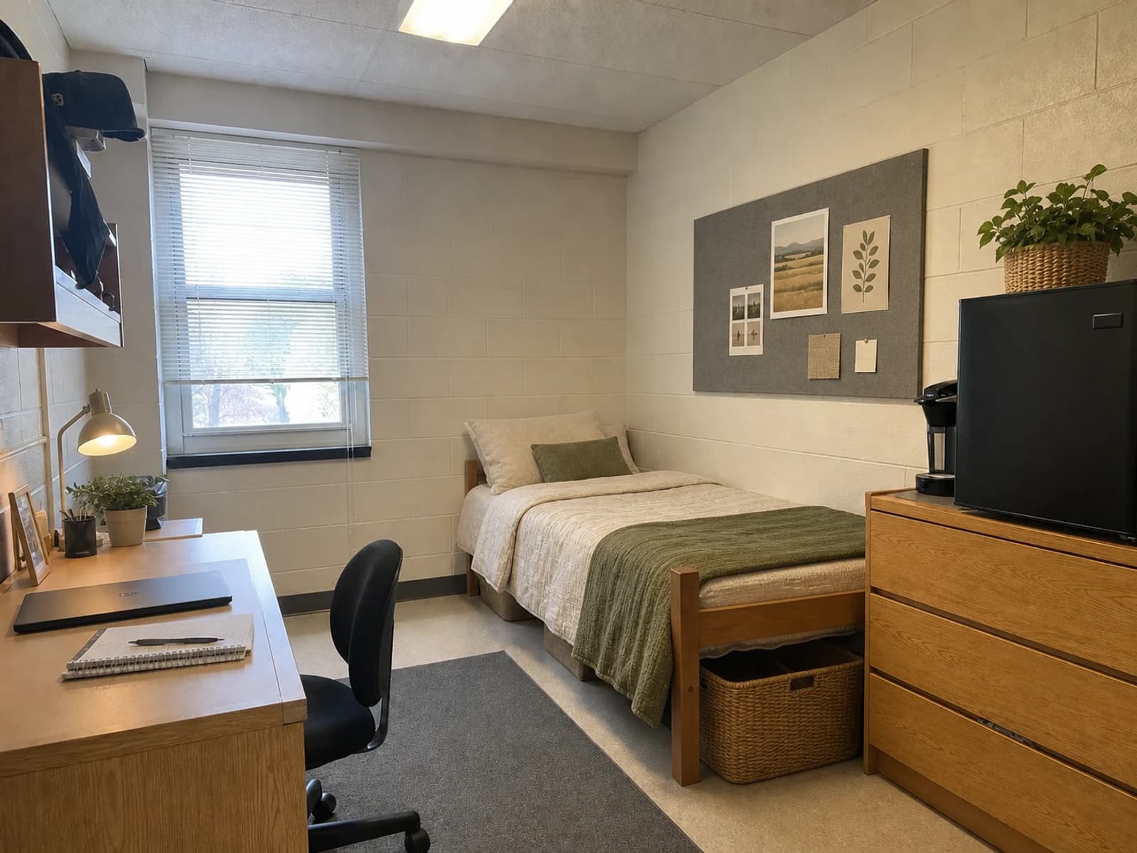
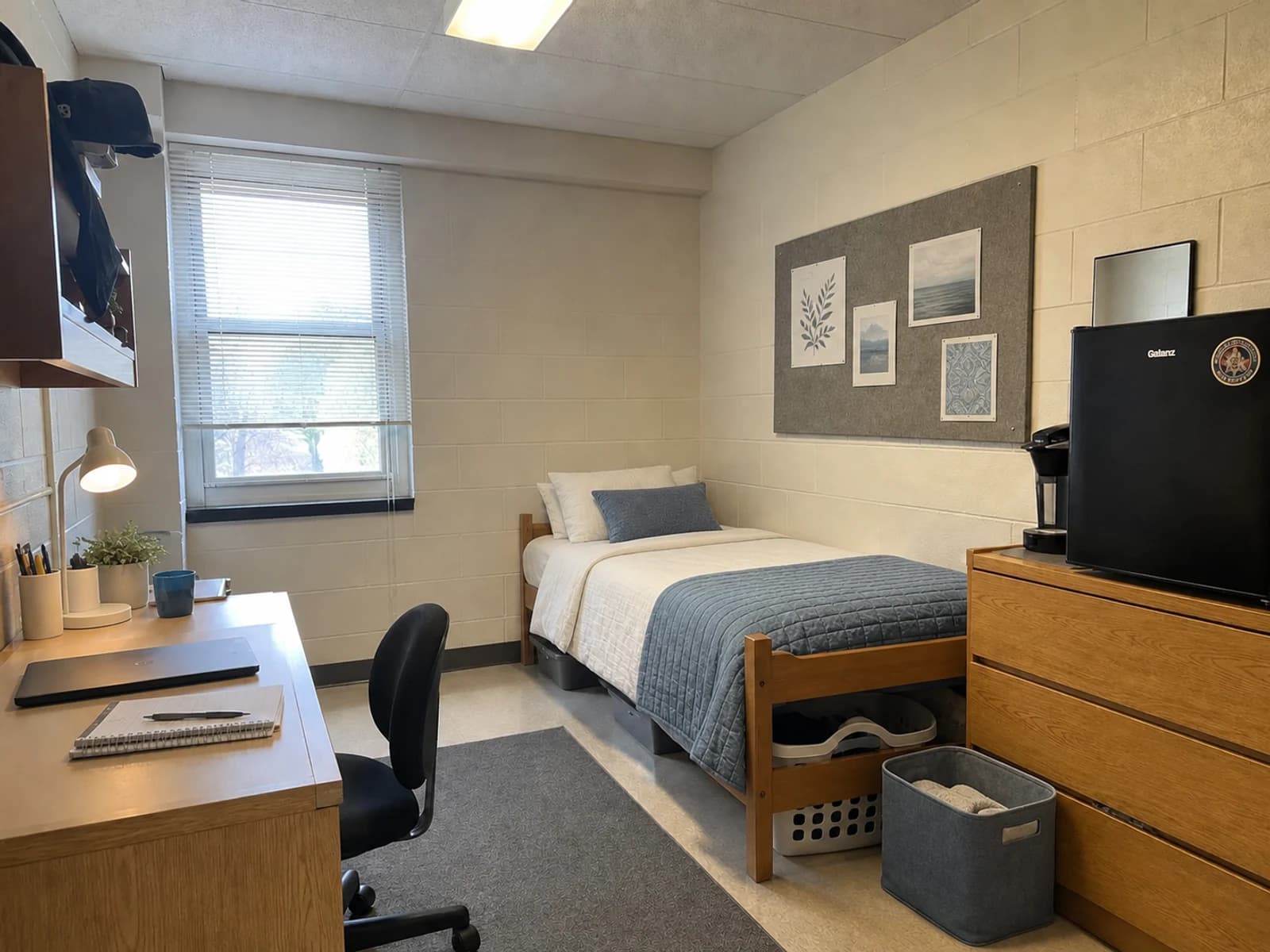
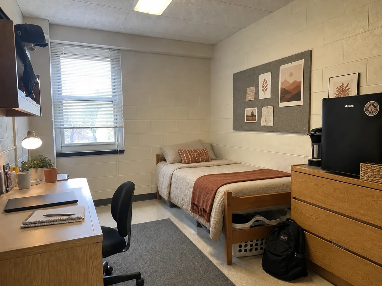
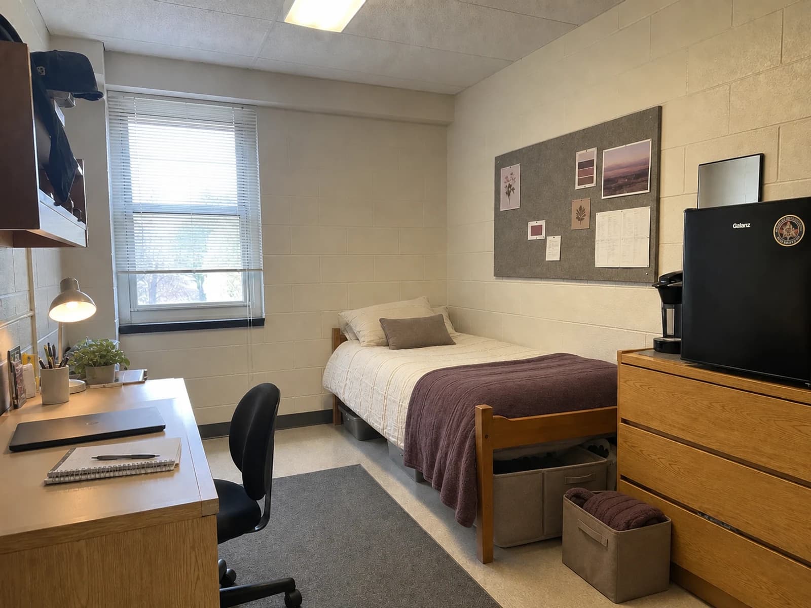
What changed: bedding, throws, small pillows, storage presentation, desk accessories, task-light mood, and removable art direction. What stayed: every major architectural feature and school-furnished item. What to verify: mattress size, rug and storage clearances, electrical and hanging rules, product colors in real light, material quality, and current availability.
12 Color Schemes and When Each One Works
1. Warm Ivory, Oatmeal, Olive, and Charcoal
This is the most forgiving scheme for a common mix of cream walls, honey-oak furniture, gray flooring, and black appliances. Ivory bedding keeps the largest surface light; oatmeal relates to the wood; muted olive bridges warm and cool finishes; charcoal repeats the chair or refrigerator. Use olive on a throw and one pillow rather than every storage bin. Natural-looking woven texture supports the palette without adding another color.
2. Dusty Blue, Ivory, Slate, and Natural Oak
Choose this when the floor or supplied furniture leans cool gray. Dusty blue is softer than navy and less themed than bright turquoise. Keep the comforter ivory, place blue on a quilt or throw, and let slate appear in felt bins or one frame. The existing oak becomes the warm counterpoint, so there is no need to cover it. If the room's daylight makes the blue look icy, select a slightly green-gray version.
3. Terracotta, Oatmeal, Cream, and Walnut
Terracotta works especially well with beige block walls and orange-toned wood because it treats their warmth as intentional. Choose an earthy clay rather than a bright pumpkin orange. Cream and oatmeal prevent the room from becoming heavy, while a small walnut or dark-brown note adds definition. Put clay on a washable throw, lumbar pillow, or print; avoid repeating it across bedding, rug, storage, and every wall accessory.
4. Muted Plum, Mushroom, Ivory, and Aged Brass
Plum is useful when you want richness without relying on black or navy. Mushroom taupe connects gray floors and warm wood, and ivory gives the deeper accent enough breathing room. Use the plum on one textile and a small amount of art. Brass belongs in a lamp detail or frame only if permitted and already practical. Avoid bright violet, cool silver-gray, and stark white in the same scheme; together they can make warm dorm furniture look more orange.
5. Navy, Camel, Warm White, and Black
This tailored palette can absorb a black refrigerator, chair, or bed hardware without making those pieces feel accidental. Warm white bedding prevents navy from dominating the small room, and camel repeats the tone of oak furniture. Use navy on a throw, piping, or one striped textile. A cognac- or camel-colored tray can bridge the bed and desk. Skip a navy comforter plus dark rug if the room has limited daylight.
6. Sage, Soft White, Clay, and Graphite
Sage is quieter and grayer than olive, so it suits off-white walls and neutral tile without reading as military or rustic. Soft white keeps it fresh, a small clay note adds warmth, and graphite repeats black equipment. This palette works well when roommates want natural colors but do not want identical bedding: one side can lead with sage and the other with soft white, while both repeat graphite storage or frames.
7. Charcoal, Flax, Stone, and Rust
Use this scheme when black metal, dark appliances, or a gray pinboard already commands attention. Flax bedding brings warmth, stone storage keeps the transition quiet, and a restrained rust accent prevents the palette from feeling like office furniture. Charcoal should repeat existing dark items rather than create a new dark block. A single rust pillow or desk cup is enough; the room does not need a second dominant accent.
8. Blush, Burgundy, Cream, and Taupe
Blush becomes more grounded when paired with burgundy and taupe instead of bright white and shiny gold. The deeper red gives the small room a focal point, while cream handles the largest bedding area. This scheme is strongest beside warm gray floors, oak furniture, and cream walls. Repeat blush in two soft textiles, burgundy once, and taupe in storage. If the fixed room is very cool, choose a dustier rose rather than peach.
9. Forest Green, Tan, Ivory, and Black
Forest green can make institutional beige and orange-toned oak feel deliberate. Because it is visually strong, keep it to the throw, one pillow, or a few art details. Tan relates to the wood, ivory brightens the bed, and black incorporates the chair or appliance. This is a practical shared-room palette because one roommate can use more green while the other uses mostly ivory and tan, with black as the common line.
10. Lavender-Gray, Stone, White, and Pewter
For a room with cool gray carpet, white walls, or gray laminate, a smoky lavender can add personality without clashing. Look for a shade with visible gray rather than candy purple. Stone bins and pewter accents keep the result cohesive; white bedding supplies light. If the furniture is warm oak, repeat a little of that warmth through a natural frame or basket instead of introducing yellow-beige fabric.
11. Butter Yellow, Denim Blue, Cream, and Cognac
This palette gives a dim or neutral dorm a cheerful note while still respecting honey-oak furniture. Cream should remain the base, denim blue supplies the steady mid-tone, and butter yellow appears in the smallest amount. Cognac is often already present in the wood. Choose a muted yellow with a little brown in it; lemon yellow beside cool fluorescent light can feel harsher than it looked online.
12. Black, Warm White, Cognac, and Gray
A limited black-and-warm-white scheme is useful when the room contains a black chair, refrigerator, television, or metal frame plus medium oak furniture. Warm white bedding balances the dark equipment, cognac treats the wood as a feature, and gray connects the floor. Use black in thin lines—frames, a desk organizer, or one stripe—rather than a large bedspread. Texture keeps this simple palette from feeling flat.
What Room Foundry Preservation Looks Like
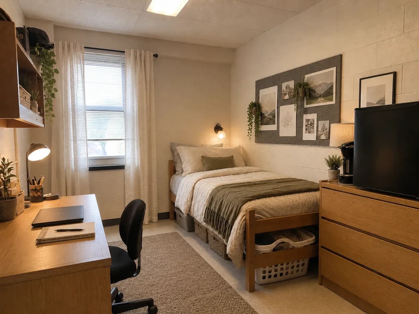
The verified Room Foundry preview below uses the same base dorm in a modern olive-and-neutral direction. It is separate from the four editorial palette studies and demonstrates the product's preservation behavior rather than claiming an installed outcome.
 before
 after
afterStayed: the room shell, fixed openings, school furniture, appliance zone, and circulation. Changed: the bedding palette, storage presentation, lighting mood, art, and surface organization. Still verify: exact color under real lighting, physical scale, clearances, residence hall rules, materials, and any visually similar product.
For more detail on preserving the supplied bed, desk, and storage in a generated plan, read how to redesign around existing furniture.
Dorm Color Mistakes to Avoid
- Choosing the entire palette from product photos before seeing the room in daylight
- Ignoring the undertone of the supplied wood, flooring, wall color, or large appliance
- Using equal amounts of every color instead of choosing a clear base and accent
- Buying matching bins, rug, curtains, and bedding before measuring the actual room
- Making both roommate sides identical when a shared neutral and accent would be enough
- Treating a preview or hex value as a guarantee of real fabric, material, or lighting color
If you want one specific light-and-blue direction, the coastal dorm room guide shows how to use ivory, sand, and sunwashed blue without beach-house clichés.
Final Thoughts
A pulled-together dorm does not need perfectly matched products. It needs a palette that acknowledges the room's fixed colors, assigns each new color a clear role, and repeats the main accent with restraint. Start with bedding, bridge the walls and floor through one useful textile or storage material, and wait to buy size-dependent pieces until you have measured the real room.
FAQ
Common questions
- What is the best color scheme for a small dorm room?
- A light neutral base with one muted mid-tone color and a small amount of contrast is the most flexible starting point. The best specific palette depends on the undertones in the fixed walls, flooring, furniture, and daylight.
- How many colors should a dorm room have?
- Three or four roles are usually enough: a light base, a main color, a supporting neutral or natural material, and a small contrast color. Those roles can include finishes already supplied by the school.
- How do roommates choose a shared dorm color scheme?
- Agree on one neutral and one repeated accent, then let each roommate use different patterns or secondary colors. Coordinate the rug, storage, and shared appliance area without requiring both beds to match.
- Should dorm bedding match the walls or the floor?
- It does not need to match either one exactly. Choose bedding with an undertone that relates to the largest fixed finish, then use a throw, rug, or pillow to bridge the wall, floor, and furniture colors.
- Can I use dark colors in a small dorm room?
- Yes, as controlled accents. Deep navy, forest green, plum, burgundy, or charcoal can add definition on a throw, pillow, art, or storage bin while the bedding and largest surfaces stay lighter.
Keep exploring
Related reading
Try Room Foundry
Test a color direction in your own dorm room.
Upload one room photo and preview a more coordinated bedroom direction around the walls, flooring, and furniture you actually have.
Preview your dorm room free